.avif)


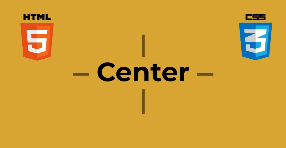
Center DIV elements along X and Y axes
Sometimes when you get at a design mockup of a website or some mobile application, you might find an element centered horizontally and vertically relative to the screen. For the designer, this might have been easy if they were using, say, Adobe Illustrator or Sketch or Figma — it's just a matter of two clicks to center design elements. If you're a developer trying to transform that design into code, you might be face-palming yourself. Well, you might have the horizontal axis covered using either an automatic margin or text-center, but happens to the evil vertical Y-axis? Stress not! Here are 5 glorious ways to perfectly center your text or div element along both axes.
Sometimes when you get at a design mockup of a website or some mobile application, you might find an element centered horizontally and vertically relative to the screen. For the designer, this might have been easy if they were using, say, Adobe Illustrator or Sketch or Figma — it's just a matter of two clicks to center design elements. If you're a developer trying to transform that design into code, you might be face-palming yourself. Well, you might have the horizontal axis covered using either an automatic margin or text-center, but happens to the evil vertical Y-axis?
Stress not! Here are 5 glorious ways to perfectly center your text or div element along both axes.
To set up, let's first look at what we'll be working with:
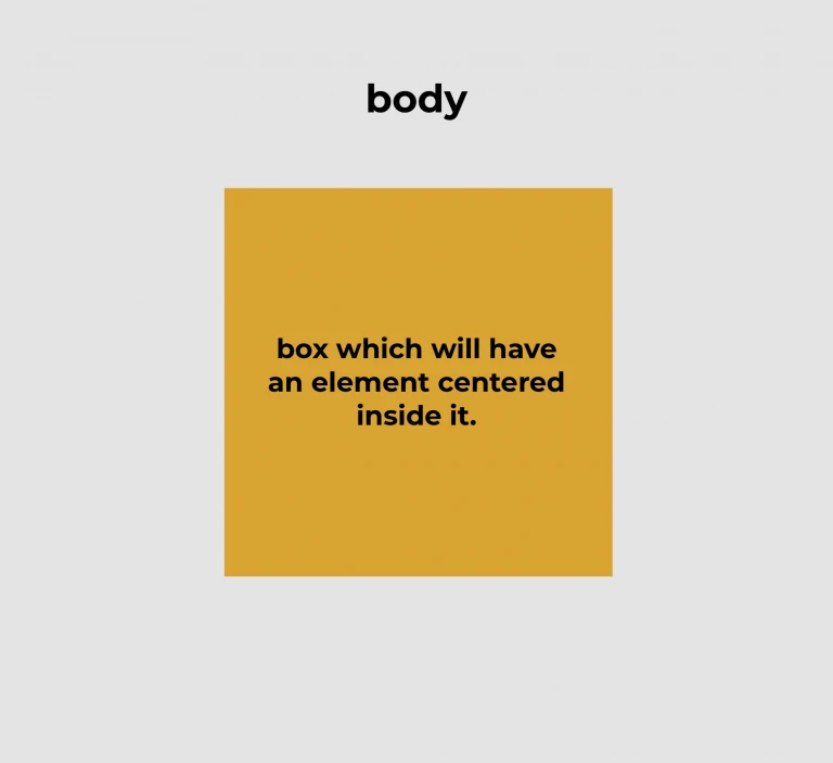
The golden box within the <body> is our container or parent <div> element inside which we can center more elements. In our examples, we'll stick to centering text, and elements that may have more child elements.
To set the canvas (the image above) for our example, we'll use a light gray background for the <body> and use a golden box positioned in the middle within.
Here's some CSS to get us started.
We're all setup for now. Let's dive into our first method.
Method 1: Using Tables
This method is great if you want to center some text.
Here, we have to set the display property of the .parent element to table. Then for the child element (h5), we'll need to set the display property to table-cell. To vertically center the text, just use the vertical-align: middle CSS property and that's it!
Note: This is an old-school way and I wouldn't necessarily recommend this, however, it's a way nonetheless.

Method 2: Grid
This method works much like the one above except it works with more than just text elements — you can center entire block elements inside as well. Also, you don't need to use any CSS for the .child element to center it. However, a bit of styling for this didn't really hurt;)
Tip: A shorthand replacement for justify-content: center and align-items: center is a simple one-liner:

Method 3: Using Positions
For this method, we'll be using the position values of relative and absolute. You may already know this — to use the position: absolute property for an element correctly, you'll need to set its parent's position property value to anything that is not static.
Tip: The translate values are a really cool way to center elements without having to bother about calculating the height or width of the element and then subtracting half of those values from the top and left values. The -50% translate values automatically calculate this for you.
Method 4: Using Flex
This is currently the most popular way to center elements. Let's look at the code.
Here again, we do not need to use any CSS for the .child element to center it.
Method 5: Using Margin Auto
Now that we understand how the display properties of grid and flex work, let's look at the following code.
Here, the display property for the .parent element can be set to use either grid or flex values. For the .child element, simply set the margin to auto to center it along both the X and Y axes.
There you have it! 5 really great ways to show your designer who's boss!
A big shoutout to Kevin Powell for helping me learn cool new things and being a source of inspiration!
Need this inside a real product? ARITS does front-end and web platform work.